Web Design Trends For The Fashion Industry
DRAWING ATTENTION WITH IMAGES
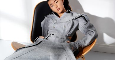
Most fashion websites rely on the power of visuals to draw attention, and let the product speak for itself. Using photographs is imperative, large images and videos are very popular. In most cases, the homepage consists of a large background photo and a navigation menu. The rest of the content is pushed to the background so it doesn’t compete with the product that’s displayed.
Black and white is a common colour scheme on fashion websites, especially those that are supposed to convey an image of elegance and class, meanwhile young and playful brands use a lot of colour.
The main objective of a fashion website is to keep viewers on the site long enough for them to see the latest product collection. Some fashion websites have interactive elements and try to transform visits into a sensory experience for the viewer.
BREATHTAKING COLOR SCHEMES
As we know, colors are crucial in fashion design. The same can be said about fashion industry website design.
Whether it’s a whole range of colors or just a couple of shades of green and blue, the schemes seem to be prepared with great care, just to keep users watching… and that is the ultimate goal of these websites.
FLUID LAYOUT
The whole experience of browsing through fashion websites can be brought down to these words: a constant flow. These websites are supposed to be a never-ending scroll, keeping the user engaged in a story or a journey through the world of the newest collections.
Again, the ultimate goal of fashion websites is to keep you engaged and interested. So you scroll and you look and browse and choose, and even though you might not buy anything, the whole experience will surely make you remember the brand. It doesn’t have to be very intuitive – at times users might find themselves lost in a place where no logical navigation could have lead them – but that’s the way it’s supposed to be! The impression is everything, not the functionality of the website.
VIDEOS AND PRODUCTS
Fashion brands often want to present products in a way no one else would – they need to stand out. Either it’s a peculiar fashion show, a stunning session with wild animals or, in this case, a video full of products that clients can admire during what they were made for – walking.
The Geox Amphibiox website shows an efficient combination of video on website and a product catalogue, as well as an example of viral marketing.
Source by Bartek Nowak

