Olding Is the New Blanding: Luxury Brands Look Back to Get Ahead | Intelligence, BoF Professional
PARIS, France — Valentino isn’t what you’d consider a “logo-driven” brand: creative director Pierpaolo Piccioli has won visibility not with a monogrammed print, but with runway collections that deftly mix ultra-soft femininity and dramatic proportions. (Think Lady Gaga in Venice, wearing a pink feather gown the size of a small boat.)
That isn’t to say Valentino hasn’t emblazoned commercial products with its fair share of logos and other brand signifiers which can be key to success in a rocky fashion market, where status symbols that are instantly recognisable, in the physical and digital realms, are driving sales.
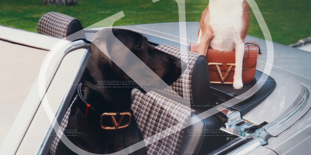
The Roman house has long played with its more formal “Valentino” signature, a punchier “VLTN” declination, and “V” hardware on bags and belts, not to mention “rock stud” detailing on strappy stilettos and sweaters that is almost as recognizable for fashion fans as a logo. But lately, Piccioli has focused on an older signifier plucked from Valentino’s archives: a ring with the letter “V” inside that was the brand’s main logo during its rise in the 1970s.
After deploying the logo on thick brass hardware for bags and belts, as well as printing it on t-shirts and pleated skirts, the brand is partnering with niche magazines and Instagram meme accounts to promote it. Another, Oddo, Purple and 032c have all produced sponsored content for their upcoming print issues featuring the “V” products, while meme creators like fashion photoshopper @Siduations and astrology jokester @Youvegotnomale were asked to post about it.
“Valentino is not a house where a logo has been used continuously, but even if you don’t use something continuously it can remain in the memory of consumers,” Piccioli said in an interview, explaining the push. The V logo “best interprets the boldness and the elegance of the brand,” he added.
Speaking on Zoom from his studio in Rome last week, as Italy prepared to roll out heightened measures to fight a new wave of coronavirus, Piccioli said it made sense that Valentino and other houses were looking back to their founding codes in a fashion market roiled by uncertainty. “When times are strange, you need reassurance,” he said.
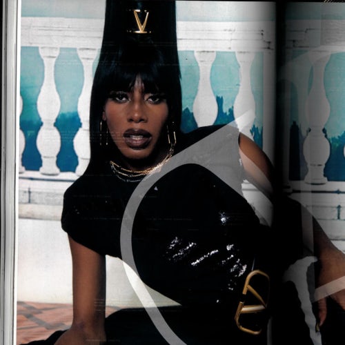
Another magazine shot brass belts and hair clips featuring the original Valentino ring logo. Source: courtesy
After flooding the market with novel designs and regularly refreshed visual identities as creative directors rotated among brands, European luxury houses now seem to be looking back to their histories as a way to move forward amid the coronavirus crisis. They’re betting that bringing back original signifiers and refocusing on their most iconic products will help them stand out in a sea of sans-serif lettering, as well as conveying lasting value after a period of design excess.
At Celine and Lanvin as well, original logos and iconography have been reinstated, albeit with subtle updates. At Gucci, iconic signatures and reissues of classic items have reclaimed centre stage, as the brand repositions designer Alessandro Michele‘s maximalist vision. Houses like Givenchy and Prada have also shown they’re willing to leverage familiarity, if not their original heritage as much, by “playing the hits” from less distant eras.
From ‘Blanding’ to ‘Olding’
In recent years, an ultra-streamlined look dominated brand logos as companies sought to evoke both modernity and timelessness in a way that was easy to read on a smartphone screen. A schema went viral online in fashion and typography circles, showing how brands ranging from Yves Saint Laurent to Balmain to Burberry had all adopted a similar blocky, sans-serif styling. Even as typography buffs pointed to subtle differences and various subliminal messages among the new logos, the phenomenon was also maligned as “blanding” (a term coined by creative director Thierry Brunfaut).
“There was a need to clean up logos in a way that you could read them very small. Brands were going super simple, super graphic even if it didn’t make much sense for their DNA,” New York-based creative director Fabien Baron said.
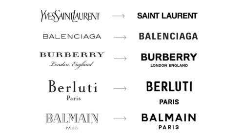
This “blanding” chart circulated widely in design circles online. Now more brands seem to be taking another tack. | Source: Twitter
Now, with Covid clouding the outlook for consumers and brands alike, “olding” seems to be pulling ahead as the favoured strategy for companies who wish to update their visual identities.
“People need to go back to the source, and focus on why they’re in business in the first place,” Baron said.
At Celine, designer Hedi Slimane has been mining the brand’s original 1970s rise, bringing back the “triomphe” double-C motif as a logo, as hardware on bags, and as a monogram for canvas accessories. For his recent spring collection, he went a step further, cranking out merch including baseball caps with the brand’s old horse-and-buggy signature or “C” characters lifted from former monogram prints.
Lanvin has also brought back a classic motif, tapping creative director Ezra Petronio to update the mother-and-child icon devised by the house’s founder Jeanne Lanvin more than 100 years earlier (it is meant to depict the couturier with her only daughter).
Faced with levels of uncertainty most consumers and brands have never lived through before, tastes are bending toward the familiar on the product front as well. Shoppers may be less susceptible to novelty than to the message that they are investing in a product that won’t go out of style. Brands, for their part, are increasingly drawn to products they could carry over from one season to the next.
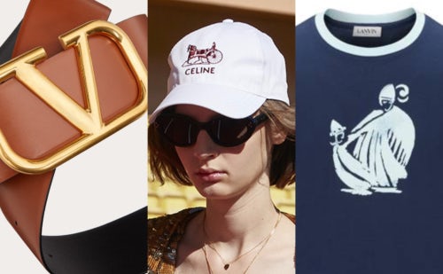
Old logos making a comeback at Valentino, Celine, and Lanvin. Source: BoF collage
At Gucci, annual sales continued to fall over the summer after several years of explosive expansion (even as similarly big and well-funded brands returned to growth). The brand has tried to quickly refocus from Michele’s wolf, cat and cicada-adorned accessories to a more classic offer including the reissues of its 1960s Jackie bag or the Horsebit 1955 line: sleek bags with little decoration other than the brand’s signature horsebit hardware. Even the steadiest players seem to be ceding to the pressure to “play the hits.” Hermès has been advertising its iconic Birkin bag, previously marketed by word-of-mouth alone.
To be sure, going back to the source is not a new idea: designers always balanced demand for new designs with playing to heritage stories. Even Michele’s wildest designs for Gucci often featured the Rococo layering of references mined from the house’s archives rather than new motifs. The novelty came from the way he put it together. And at Dior, Maria Grazia Chiuri has leaned heavily into the founder’s “bar suit” silhouette as well as finding new uses for the house’s monogram pattern from the 1960s.
Going back to the source doesn’t always work, either, especially if the references have faded too far from public awareness or no longer seem luxurious enough. At Givenchy, Clare Waight Keller brought back the houses’ founding codes with romanticism and severity in equal measure. It didn’t take. As the brand transitions to new designer Matthew Williams, it’s gone back to promoting the logo-heavy merch (with white letters on black t-shirts, backpacks, and pool slides) that was popularised by Waight Keller’s predecessor Riccardo Tisci as recently as 2016. It’s a different sort of olding: travelling not back to the origin of the brand itself as much as to the source of its current popularity. At Prada, a reissued nylon baguette from 2005 is currently a hit.
Authenticity is Key
“At the moment we might expect consumers to seek reassurance in the blue-chip symbols that address nostalgia,” said Peter Saville, the British creative director responsible for several of the industry’s sleeker rebranding efforts, including logos for Burberry and Calvin Klein. “But in fashion, I think that’s going to be short-lived. Most companies wish to position themselves in the context of the now.”
The important thing, Piccioli said, when mining classic references, is to avoid nostalgia, or simply cut-and-pasting an old idea into the present moment. “It’s about re-signifying — giving different and modern meanings to the same codes.”
Saville suggests a slightly wider lens. “My value system at the moment would be one of authenticity. It might be future looking; it might be retrospective,” he said. “We have a very sceptical audience now, who will seek out things they can trust and things they can believe in.”
Related Articles:
Op-Ed | The Revolution Will Not Be Serifised: Why Every Luxury Brand’s Logo Looks the Same
How Not to Be a Boring Direct-to-Consumer Brand
Can a New Chief Bring Commercial Magic Back to Valentino?

