Has Fashion Retail Reached Peak Minimalism? | BoF Professional, News & Analysis
When decorating her new store in Soho, Tory Burch wanted to create a place where shoppers could “feel like they are stepping into my living room.” It features ceilings covered in woven baskets, motif-painted bannisters, granny-chic chintz sofas, a splashy chandelier made of quilted patchwork and plenty of knickknacks hand-selected by Burch herself.
It’s a shift from the luxury and fashion stores that neighbour Burch’s Soho boutique, with predominantly pristine, sparse interiors, white walls and fluorescent lighting. But Burch wanted her location to feel differentiated through details, “as opposed to creating the same environment everywhere.”
Burch is one of a growing number of designers who are leaning into a maximalist retail design in a quest for differentiation — a pivot after much of fashion has spent the last decade focusing on minimalism.
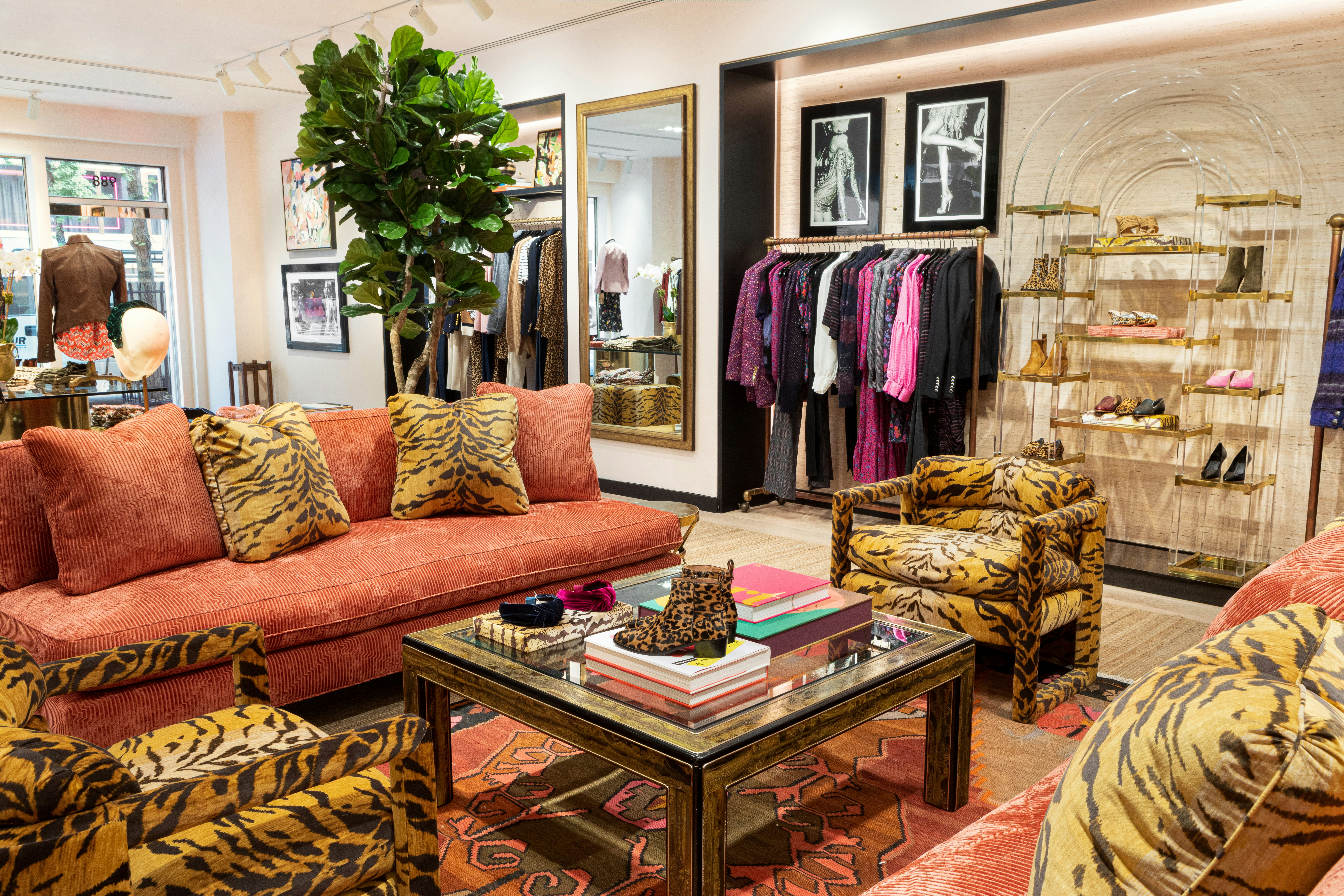
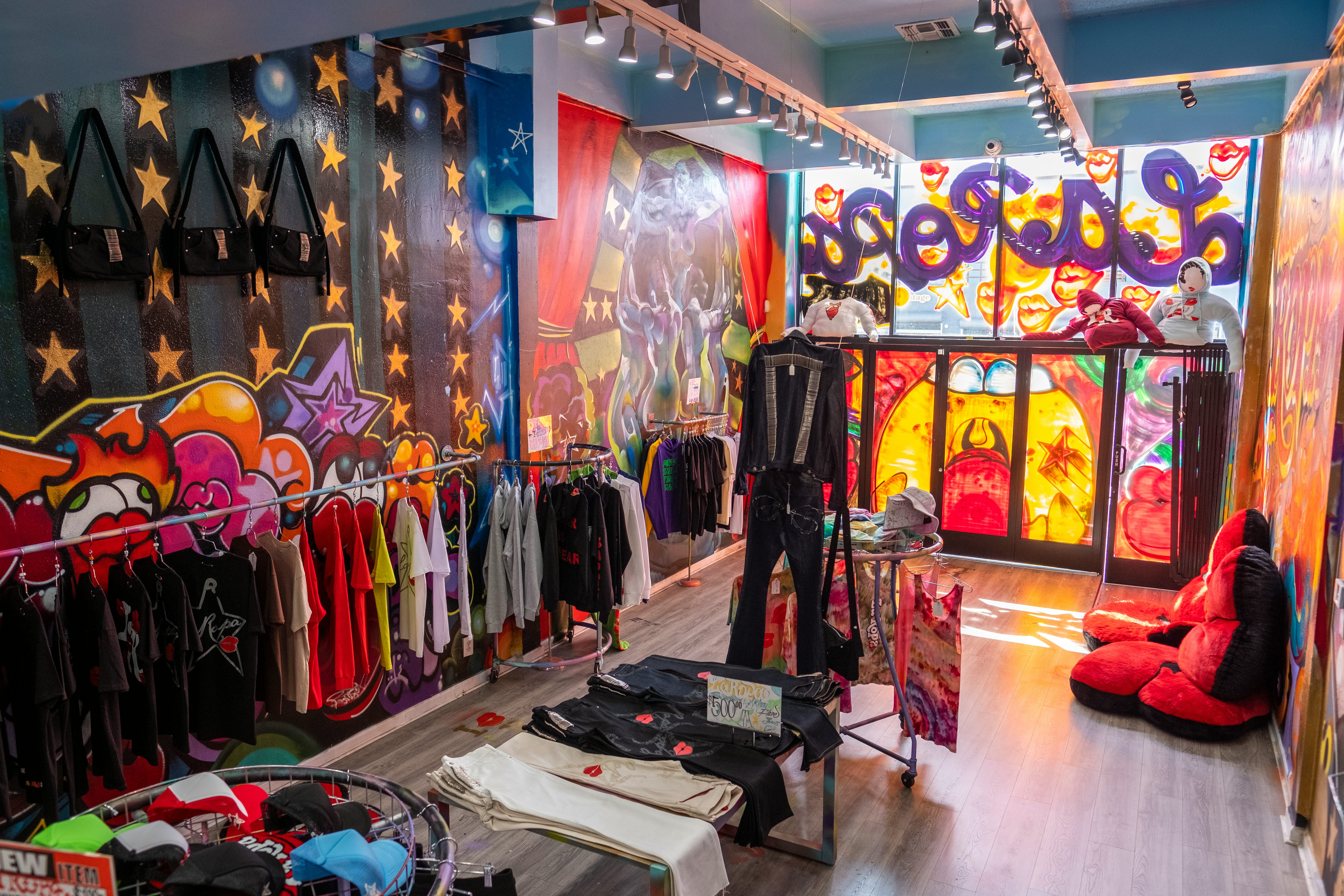
Veronica Beard stores feature crowded gallery walls and animal-printed furniture, and the brand intends to go all-out with an art-deco theme for its upcoming store in Miami. As co-founder Veronica Swanson Beard explained, “we want each store to feel like a destination.” PatBO, a Brazilian fashion brand from said designer Patricia Bonaldi opened a store in New York in September and used tropical wallpaper and ornate raffia pendants to introduce American shoppers to the brand. Streetwear brand La Ropa opened a store in New York City in late October that has loud, colourful graffiti and giant red bean bag chairs.
The fashion brand Veronica Beard uses maximalism in its retail design to differentiate itself. Veronica Beard
Even minimalist gurus say they are evolving. Alex Mustonen, the co-founder of Snarkitecture, the Brooklyn-based design firm behind Kith’s stores, said he’s been designing with more colour and detail lately and is increasingly “pushing against those who would assume our work is all white,” he said. For Kith’s Paris store, which opened in February, Mustonen introduced velvet blue couches, woven rugs and colourful floors.
Stores shouldn’t feel like museums, they should be a space that expands the brand’s narrative.
Minimalist retail design has long dominated fashion spaces, with the exception of brands like Gucci, which underwent a global store redesign in 2016 to highlight the brand’s shift towards whimsical eclecticism that came with appointing Alessandro Michele the year before. But much like how some brands have moved away from “blanding” in their marketing in order to stand out, some design experts recommend fashion embrace interiors that have more flavour. And post-pandemic, fashion needs to be using every resource possible to push shoppers back into stores, added Michael Gatti, a principal at architecture and design firm Gensler.
“For me, stores should ooze with the personality of the brand,” said Gatti, who has worked with brands like Tiffany, Cartier and Saks Fifth Avenue. “Stores shouldn’t feel like museums, they should be a space that expands the brand’s narrative.”
Minimising Minimalism
Fashion’s reliance on muted interiors draws from the art world, said Kyle Chayka, a culture columnist at The New Yorker and author of “The Longing for Less: Living With Minimalism.”
“The galleries developed this technique … to use big, white empty spaces to place emphasis on art objects and it works in a retail context when you are trying to focus someone’s attention on one very special thing,” Chayka said.
Luxury fashion copied the art world and the rest of the industry followed. Minimalism also dominated fashion because it is easy to execute, said Robin Standefer, co-founder of design firm Roman & Williams, which has worked with brands like Cole Haan and Goop.
Many fashion brands also lean on the concept because it helps a shopper focus on specific products, said Emiliano Salci, co-founder of design firm Dimorestudio, which has designed stores for Fendi, Dior and Lanvin.
The museum-store trend has not left room for differentiation. The pitfall is that they look like everyone else.
“The guidance we’ve gotten from clients is to produce these very neutral spaces because the collection, at the end of the day, will be the protagonist,” said Salci.
But the danger fashion now finds itself in is that many stores look the same, according to Gatti. “The museum-store trend has not left room for differentiation,” he said. “The pitfall is that they look like everyone else.”
The Pendulum Swings
The hunger for maximalism is growing beyond fashion. In interior design, consumers have embraced so-called ‘Grandmillennial’ styles like wicker furniture and patterned upholstery. Restaurants and hotels, as well, have “moved to feel more residential, detailed and just warmer in general,” said Standefer.
For fashion, incorporating touches like eccentric furniture and ornate light fixtures can help “ignite the senses, elicit a strong emotional reaction,” Standefer said.
Brands that lean into maximalism can also help customers better experience their creative vision. Swanson Beard pointed to competitors like LoveShackFancy, which deploys a rich retail design that includes ostentatious curtains and crystal-dripping chandeliers.
“You can learn so much about a brand from what style of furniture they choose,” she said.
As well, bucking minimalism helps newer names stand out. “When your store is all white, you can probably rely on 100 years of branding to do very little to sell expensive clothing, but as a new brand, you want to set up the most eye-appealing thing,” said La Ropa co-founder Aristotle Sanchez.
Maximalism also happens to work better on TikTok, today’s social media platform of choice.
The LA store of the streetwear brand La Ropa. La Ropa.
“TikTok … needs more dynamism and detail,” said Chayka. “The interior [design] vocabulary on TikTok is shots of details; artefacts, interesting moments in a corner.”
Striking the Right Balance
To be sure, not every fashion brand is abandoning minimalism. In fact, it’s still a distinct minority. Dimorestudio’s Salci, who remains loyal to a more minimalist approach, said fashion brands should not “confuse maximalism with quality.”
“What you’re trying to achieve in a space … is to focus on product in a subconscious manner and this is easily achieved through reducing,” added John Elliott, who just opened a sparse boutique in New York.
But for the brands that are keen to pivot from minimalism, Standefer recommends creating retail environments that mimic a home.
“People today have a really big appetite for interesting interiors of homes and those environments create a really interesting, comfortable flavour and attitude,” she said. “Instead of creating a blank canvas for a collection, allow an environment to respond and ignite.”
Instead of creating a blank canvas for a collection, allow an environment to respond and ignite.
Exaggerated design also doesn’t have to feel overwhelming or messy. When designing floor concepts, Swanson Beard said brands should be thinking about the presentation of the clothing before strategising a store’s overall design. Veronica Beard, for example, will first set up specific areas dedicated to categories like denim and jackets before sprinkling design elements around those zones to enhance the store without slowing down the shopping journey.
“It’s about maximising the store for the presentation of the collection while having interior focus moments,” she said.
Gatti is also working with some clients who are trying to mesh the two worlds of minimalism and maximalism. More brands are renting bigger spaces so they can add lounge areas that are packed with brand details while keeping the shopping areas more sparse.
“It’s adding coffee bars for sitting or a library for relaxing,” Gatti said. “In these spaces, there’s more room to spark attention.”
Related Articles:
Will Prestige Beauty Sell in a Big Box Store?


