5 Email Design Tips To Increase Engagement (CTR)
Are you spending tons of hours and dollars on your email marketing strategy, but not seeing the return on your investment? If people are not clicking on your links (you have a low clickthrough rate – CTR), it means that fewer marketing-ready leads are being sent to sales.
Email Clickthrough Rate (CTR) – is the measure of how many people clicked on a hyperlink, CTA, or image within a particular email. It is the percentage of how many email recipients clicked on a link within your email out of the people who received your email.
Below are 5 tips to get your audience to engage with your emails and boost your email clickthrough rate.
Less is more for CTAs
One of the most effective ways to increase engagement is to limit the number of calls-to-action (CTAs) in your email. When you are giving choices to your readers, less is always more. It might seem like the more calls-to-action, the more clicks, however, that’s usually not the case. More choices often result in fewer conversions.
Marketers are often tempted to include multiple CTAs, hoping that they will get at least one click. Too many links can distract and overwhelm your subscribers, decreasing clickthrough rates in your emails. Sometimes too many options may even lead them to do nothing at all.
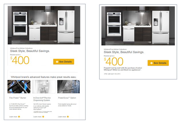
Below is an example of two Whirlpool emails (the first one has multiple CTAs, while the second has only one).
When tested against each other, the email with only one focused CTA achieved a 42% increase in clicks for Whirlpool. To get better clickthrough rates, you should try to include one main CTA that focuses the recipient on taking one single action.
When to use a button vs. text CTA
Which CTA earns higher clickthrough rates, the text link or the bulletproof button? Campaign Monitor conducted a test to find out what CTA performs best and found that a call-to-action button helped them increase clickthrough rate by 28%!
When scanning emails, a CTA button will draw more attention to the action you want your reader to take. Text links are much more likely to be missed or skimmed over. Buttons are more likely to stand out and tell them what the offer is and how to access it. It is important to test what works best for your audience. If your buttons are not performing well, you may want to test text links in your next campaign (this is not always a one size fits all solution).
You should use text links when you want to include secondary CTAs. If you do include them in your email, make sure they are noticeably long. Linking a phrase with about 7-10 words is great for boosting CTRs.
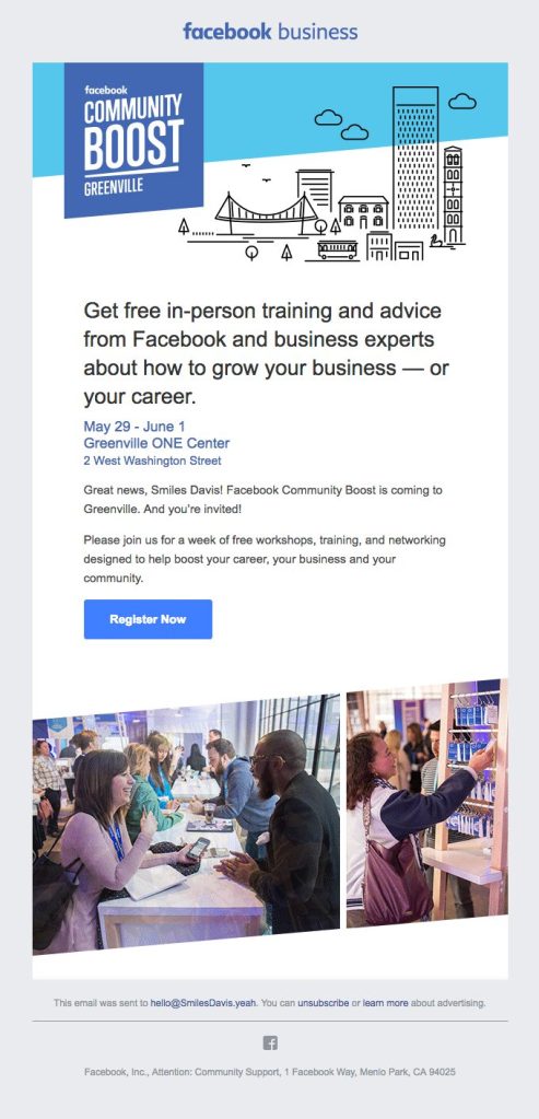
Here is a great example of a Facebook Business email from Really Good Emails that uses a clear bulletproof button CTA.
To include or not include images?
Including images in your email can be a powerful way to grab the attention of your readers and persuade them to click. It is important to make sure you use the “right” images that add value and support the content of your email. Vero analyzed over 5,000 email campaigns and found that campaigns with images had a 42% higher CTR than campaigns without images
Emails must also make complete sense even without images (also called designing for the images off experience). You should also add relevant alt text to your images. This text displays even when your images are not displayed.
Below is a Litmus example of an email not designed for images of vs one that is.
Optimize your emails
To make sure your emails are easy to read from any device, they need to be optimized for all devices. Optimizing for mobile is essential, as more people read email on mobile devices than desktop computers. You should always check if modules are stacking properly, if images are scaling without losing text readability, and if any links are too close together that people may not be able to click on them.
Unoptimized emails will be abandoned and lower your CTR. By not making your emails mobile responsive, you are missing out on a large percentage of your subscribers who will not have a good experience with your emails. Don’t use multiple CTAs, one CTA on a phone screen is all you want consumers to focus on.
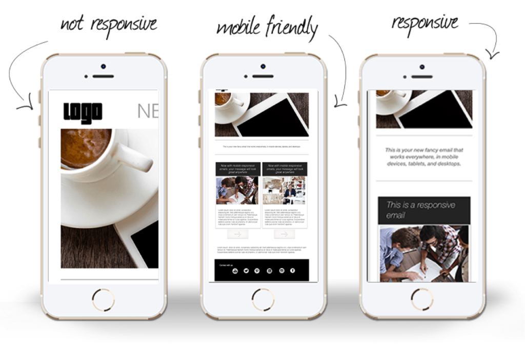
Mobile responsive emails are easier to read on both desktops and mobile devices, because text, images and buttons automatically adjust to fit the screen size. Additionally, multi-column email layouts adjust to single columns on mobile devices, and content is easy to access with both a mouse and a touchscreen.
This is an example on MailUp Blog that shows the differences between a not responsive, mobile friendly and responsive email on a mobile phone screen.
Pass the squint test
The “squint test” is evaluating a graphic layout by squinting your eyes. This tests legibility and whether the overall layout is a strong, clear layout. The goal of this test is to get a high-level view of the layout of your work. What elements stand out? Can you tell where the primary focus is? Are there too many elements on the page? The test is meant as a quick gut check to ensure that the intended outcome of the design is achieved.
Here is an example by MailChimp displaying the “squint test” on one of their emails.
Chrome also offers this nifty extension to squint test your email before sending it.
By incorporating these 5 design strategies into your email marketing program, you are sure to see an improvement in your engagement and CTR. Also make sure to test, test and test again. Email marketing and technology is constantly changing, so it is important to know your data and your audience so as to not get left behind.
If you need assistance building and testing your emails, or even putting together an entire email marketing engagement strategy, Relationship One is always here to help!
Thank you for subscribing!


